发表自话题:k线图实例分析
一、Matplotlib介绍
Matplotlib是一个强大的Python**绘图**和**数据可视化**的工具包。
# 安装方法
pip install matplotlib
# 引用方法
import matplotlib.pyplot as plt
# 绘图函数
plt.plot()
# 展示图像
plt.show()
执行后显示效果如下:
二、plot函数使用
plot函数:用于绘制折线图。
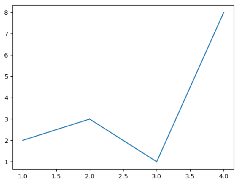
1、绘制线型图
线型linestyle:‘-’是实线、'--'是线虚线、‘-.’是线点虚线等、‘:’是点虚线。
import matplotlib.pyplot as plt
plt.plot([1,2,3,4],[2,3,1,8])
# 绘制折线图
plt.show()
显示效果如下所示:
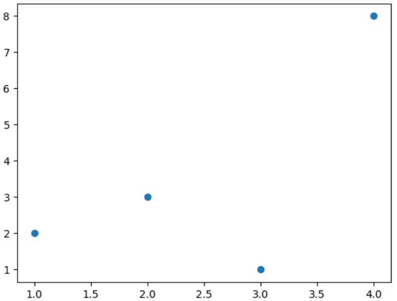
2、绘制点型图
点型marker:v、^、s、*、H、+、x、D、o.....
其中是o是圆点、v是下三角、D是菱形、H是六边形等。
(1)绘制点图
plt.plot([1,2,3,4],[2,3,1,8],
'o')
# 参数o,绘制点图
plt.show()
显示效果如下所示:
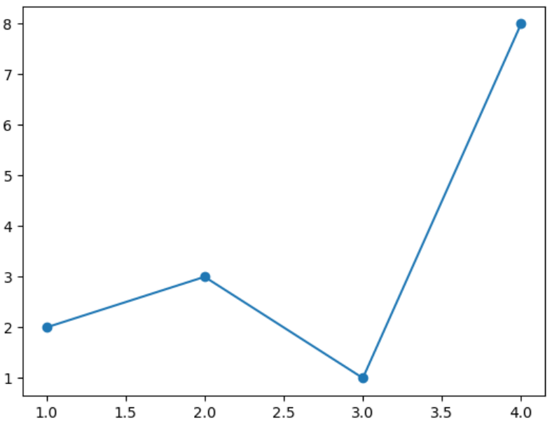
(2)绘制点线图
plt.plot([1,2,3,4],[2,3,1,8],
'o-')
# 参数o-,绘制点线图
plt.show()
显示效果如下所示:
3、绘图颜色
颜色color:b、g、r、y、k、w......
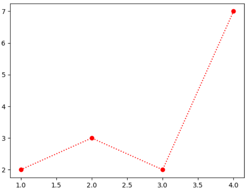
(1)方法一:配合线设置颜色
plt.plot([1,2,3,4],[2,3,2,7],
'o:r')
# 红色线
plt.show()
显示效果如下所示:
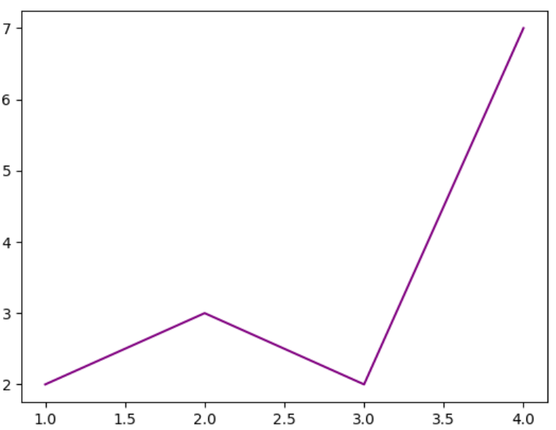
(2)方法二:用color参数设置颜色
plt.plot([1,2,3,4],[2,3,2,7], color=
'purple')
# 紫色线
plt.show()
显示效果如下所示:
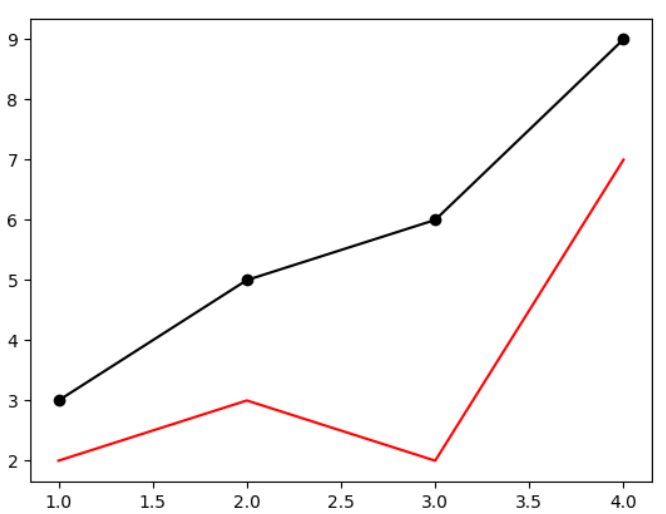
4、plot函数绘制多条曲线
生成几个plot.plot()就可以在一个图里绘制多少个曲线。
plt.plot([1,2,3,4],[2,3,2,7], color=
'red')
plt.plot([1,2,3,4],[3,5,6,9], color=
'black',marker=
'o')
plt.show()
显示效果如下所示:
三、图像标注
前面学习的plt.plot()和plt.show()函数只是绘图和显示图像。但如果要设置标题、名称等图像标注就需要用到其他函数了。
设置图像标题:plt.title()设置x轴名称:plt.xlabel()设置y轴名称:plt.ylabel()设置x轴范围:plt.xlim()设置y轴范围:plt.ylim()设置x轴刻度:plt.xticks()设置y轴刻度:plt.yticks()设置曲线图例:plt.legend()
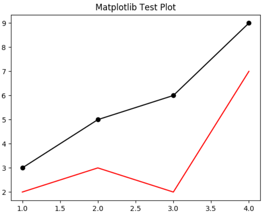
1、设置图像标题
# 引用方法
import matplotlib.pyplot as plt
# 绘图函数
plt.plot([1,2,3,4],[2,3,2,7], color=
'red')
plt.plot([1,2,3,4],[3,5,6,9], color=
'black',marker=
'o')
plt.title('Matplotlib Test Plot')
# 设置图像标题
# 展示图像
plt.show()
显示效果如下所示:
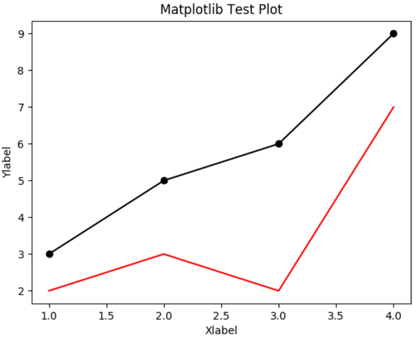
2、设置xy轴名称
# 引用方法
import matplotlib.pyplot as plt
# 绘图函数
plt.plot([1,2,3,4],[2,3,2,7], color=
'red')
plt.plot([1,2,3,4],[3,5,6,9], color=
'black',marker=
'o')
plt.title('Matplotlib Test Plot')
plt.xlabel('Xlabel')
plt.ylabel('Ylabel')
# 展示图像
plt.show()
显示效果如下所示:
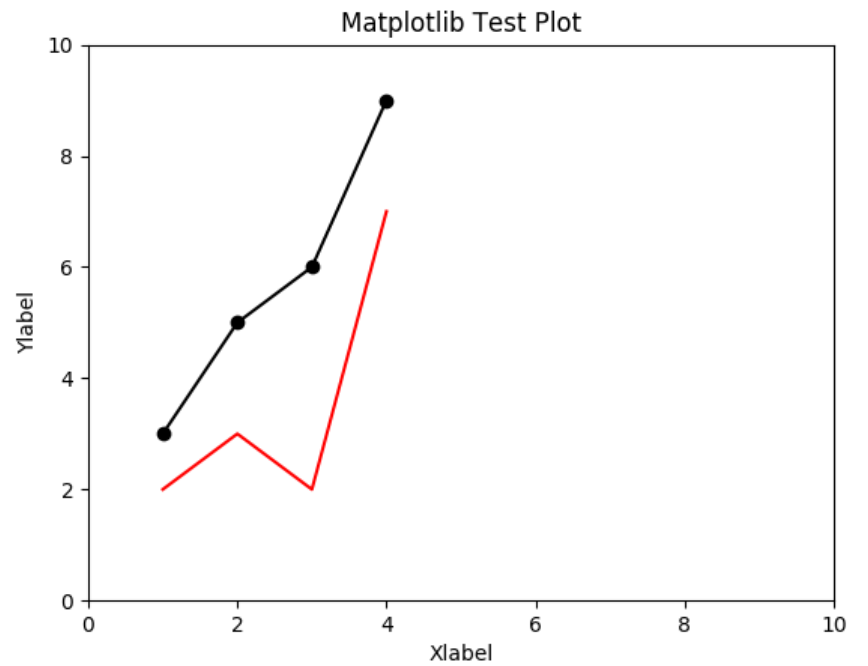
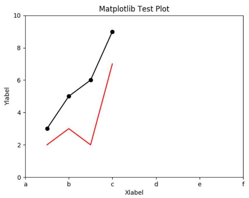
3、设置xy轴范围
# 引用方法
import matplotlib.pyplot as plt
# 绘图函数
plt.plot([1,2,3,4],[2,3,2,7], color=
'red')
plt.plot([1,2,3,4],[3,5,6,9], color=
'black',marker=
'o')
plt.title('Matplotlib Test Plot')
plt.xlabel('Xlabel')
plt.ylabel('Ylabel')
plt.xlim(0,5)
# 设置x轴最小值0,最大值5
plt.ylim(0,10)
# 设置y轴最小值0,最大值10
# 展示图像
plt.show()
显示效果如下所示:

4、设置xy轴刻度
# 引用方法
import matplotlib.pyplot as plt
import numpy as np
# 绘图函数
plt.plot([1,2,3,4],[2,3,2,7], color=
'red')
plt.plot([1,2,3,4],[3,5,6,9], color=
'black',marker=
'o')
plt.title('Matplotlib Test Plot')
plt.xlabel('Xlabel')
plt.ylabel('Ylabel')
plt.xlim(0,10
)
plt.ylim(0,10
)
# plt.xticks(0,2,4) # 设置x轴刻度
plt.xticks(np.arange(0,11,2))
# 用numpy设置x轴刻度
# 展示图像
plt.show()
显示效果如下所示:
刻度还可以自定义字段显示:
# 引用方法
import matplotlib.pyplot as plt
import numpy as np
# 绘图函数
plt.plot([1,2,3,4],[2,3,2,7], color=
'red')
plt.plot([1,2,3,4],[3,5,6,9], color=
'black',marker=
'o')
plt.title('Matplotlib Test Plot')
plt.xlabel('Xlabel')
plt.ylabel('Ylabel')
plt.xlim(0,10
)
plt.ylim(0,10
)
# plt.xticks(0,2,4) # 设置x轴刻度
plt.xticks(np.arange(0,11,2), [
'a',
'b',
'c',
'd',
'e',
'f'])
# 用numpy设置x轴刻度
# 展示图像
plt.show()
显示效果如下:
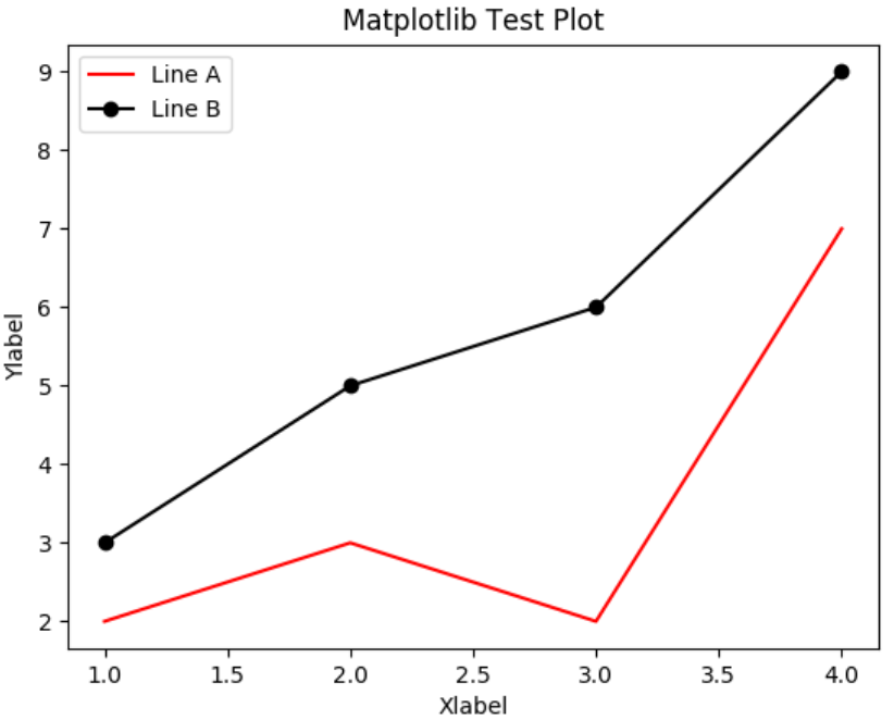
5、设置曲线图例
在plt.plot()中设置label,即可使用plt.legend()函数设置曲线图例。
# 引用方法
import matplotlib.pyplot as plt
import numpy as np
# 绘图函数
plt.plot([1,2,3,4],[2,3,2,7], color=
'red', label=
'Line A')
plt.plot([1,2,3,4],[3,5,6,9], color=
'black',marker=
'o', label=
'Line B')
plt.title('Matplotlib Test Plot')
plt.xlabel('Xlabel')
plt.ylabel('Ylabel')
plt.legend() # 曲线图例
# 展示图像
plt.show()
显示效果如下:
四、Matplotlib应用实例
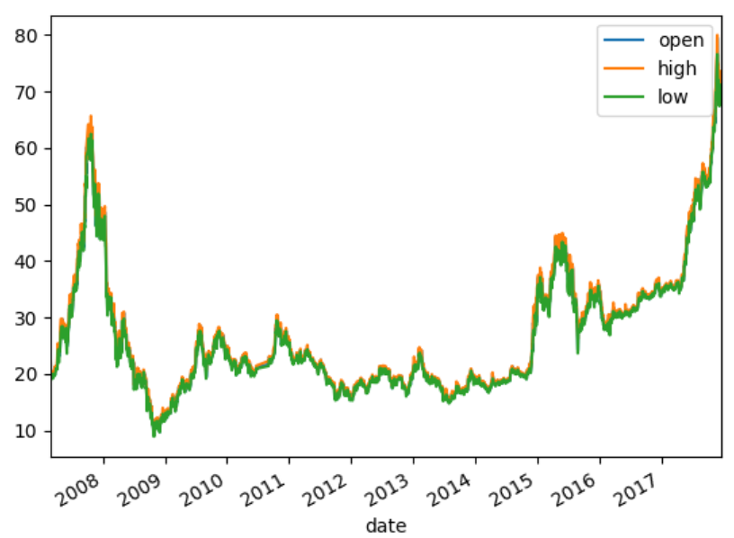
1、pandas和matplotlib结合使用
import matplotlib.pyplot as plt
import pandas as pd
df = pd.read_csv(
'601318.csv', parse_dates=[
'date'], index_col=
'date')[[
'open',
'close',
'high',
'low']]
# 读取csv文件,使用date作为索引列
df.plot()
plt.show()
显示效果如下所示:
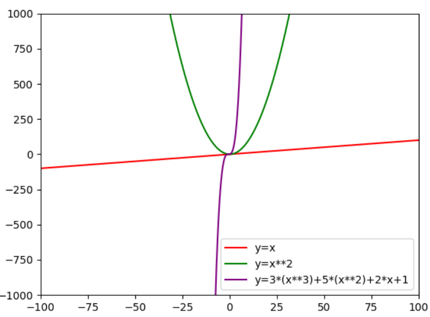
2、绘制数学函数图像
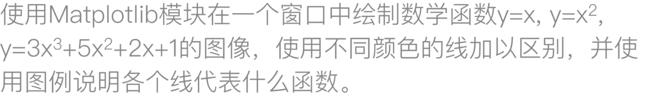
# 引用方法
import matplotlib.pyplot as plt
import numpy as np
x = np.linspace(-100,100,10000)
# 起点、终点、分多少份
y1=
x
y2=x**2
y3=3*(x**3)+5*(x**2)+2*x+1
plt.plot(x, y1, color=
'red', label=
'y=x')
plt.plot(x, y2, color=
'green', label=
'y=x**2')
plt.plot(x, y3, color=
'purple', label=
'y=3*(x**3)+5*(x**2)+2*x+1')
plt.ylim(-1000,1000)
# 由于紫色线增长过快,图片显示会导致红色和绿色重合
plt.xlim(-100,100
)
plt.legend()
# 展示图像
plt.show()
显示效果如下所示:
五、matplotlib绘制常用图表
Matplotlib提供了很多函数来支持不同的图类型,如下所示:
函数说明plt.plot(x,y,fmt,...)坐标图plt.boxplot(data,notch,position)箱型图
plt.bar(left,height,width,bottom)
条形图
plt.barh(width,bottom,left,height)横向条形图
plt.polar(theta, r)极坐标图
plt.pie(data, explode)饼图
plt.psd(x,NFFT=256,pad_to,Fs)功率谱密度图plt.specgram(x,NFFT=256,pad_to,F)谱图
plt.cohere(x,y,NFFT=256,Fs)X-Y相关性函数
plt.scatter(x,y)散点图
plt.step(x,y,where)步阶图
plt.hist(x,bins,normed)直方图
相关文档参见:matplotlib官网
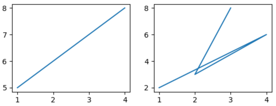
1、画布和子图
(1)子图并行排列
import matplotlib.pyplot as plt
import pandas as pd
# 画布:figure
fig = plt.figure()
# 生成画布
# 图:subplot
ax1 = fig.add_subplot(2,2,1)
# 两行两列第一个图
ax1.plot([1,2,3,4],[5,6,7,8
])
ax2 = fig.add_subplot(2,2,2)
# 两行两列第二个图
ax2.plot([1,4,2,3],[2,6,3,8
])
fig.show()
显示效果如下所示:
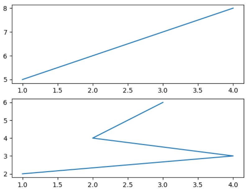
(2)子图上下排列
import matplotlib.pyplot as plt
import pandas as pd
# 画布:figure
fig = plt.figure()
# 生成画布
# 图:subplot
ax1 = fig.add_subplot(2,1,1)
# 两行一列第一个图
ax1.plot([1,2,3,4],[5,6,7,8
])
ax2 = fig.add_subplot(2,1,2)
# 两行一列第二个图
ax2.plot([1,4,2,3],[2,3,4,6
])
fig.show()
显示效果如下所示:
(3)用subplots_adjust()调节子图间距
subplots_adjust()函数源码如下所示:
def subplots_adjust(self, left=None, bottom=None, right=None, top=None,
wspace=None, hspace=None):
"""
Update the :class:`SubplotParams` with *kwargs* (defaulting to rc when
*None*) and update the subplot locations.
"""
if self.get_constrained_layout():
self.set_constrained_layout(False)
warnings.warn("This figure was using constrained_layout==True, "
"but that is incompatible with subplots_adjust and "
"or tight_layout: setting "
"constrained_layout==False. ")
self.subplotpars.update(left, bottom, right, top, wspace, hspace)
for ax in self.axes:
if not isinstance(ax, SubplotBase):
# Check if sharing a subplots axis
if isinstance(ax._sharex, SubplotBase):
ax._sharex.update_params()
ax.set_position(ax._sharex.figbox)
elif isinstance(ax._sharey, SubplotBase):
ax._sharey.update_params()
ax.set_position(ax._sharey.figbox)
else:
ax.update_params()
ax.set_position(ax.figbox)
self.stale = True
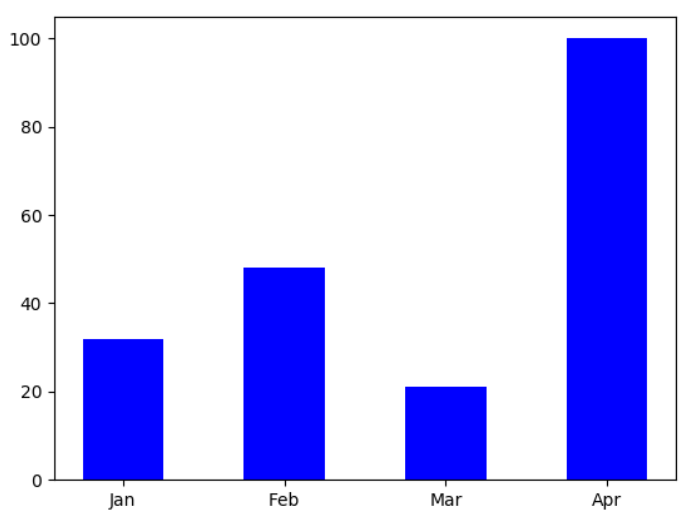
2、柱状图和饼图
(1)柱状图基本示例
import matplotlib.pyplot as plt
import numpy as np
data = [32,48,21,100
]
labels = [
'Jan',
'Feb',
'Mar',
'Apr']
# 柱状图
plt.bar(np.arange(len(data)), data , color=
'blue', width=0.5
)
plt.xticks(np.arange(len(data)), labels)
plt.show()
显示效果:
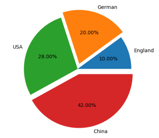
(2)饼图基本示例
import matplotlib.pyplot as plt
plt.pie([10,20,28,42], labels=[
'England',
'German',
'USA',
'China'], autopct=
'%.2f%%',explode=[0,0.1,0,0.1
])
# labels设置标签,autopct显示百分比,explode设置突出程度
# plt.axis('equal') # 设置图片朝向
plt.show()
显示效果:
3、绘制K线图
matplotlib.finanace子包中有许多绘制金融相关图的函数接口。
绘制K线图:matplotlib.finance.candlestick_ochl函数。
import matplotlib.finance as fin
但是从matplotlib 2.2.0版本开始,matplotlib.finance已经从matplotlib中剥离了,需要单独安装mpl_finance这个包了。
可以anaconda中下载mpl-finance包等方法下载。
import mpl_finance as fin
(1)candlestick_ochl()函数源码分析
def candlestick_ochl(ax, quotes, width=0.2, colorup=
'k', colordown=
'r',
alpha=1.0
):
"""
Plot the time, open, close, high, low as a vertical line ranging
from low to high. Use a rectangular bar to represent the
open-close span. If close >= open, use colorup to color the bar,
otherwise use colordown
Parameters
----------
ax : `Axes` # 图对象
an Axes instance to plot to
quotes : sequence of (time, open, close, high, low, ...) se # 二维数组
As long as the first 5 elements are these values,
the record can be as long as you want (e.g., it may store volume).
time must be in float days format - see date2num # datetime要转化为小数类型时间戳
width : float # k线宽度
fraction of a day for the rectangle width
colorup : color # 阳线颜色
the color of the rectangle where close >= open
colordown : color # 阴线颜色
the color of the rectangle where close < open
alpha : float # 矩形的透明度
the rectangle alpha level
Returns
-------
ret : tuple
returns (lines, patches) where lines is a list of lines
added and patches is a list of the rectangle patches added
"""
return _candlestick(ax, quotes, width=width, colorup=
colorup,
colordown=
colordown,
alpha=alpha, ochl=True)
(2)date2num函数用于将datetime对象转化为浮点数表示的时间戳
def date2num(d):
"""
Convert datetime objects to Matplotlib dates.
Parameters
----------
d : `datetime.datetime` or `numpy.datetime64` or se of these
Returns
-------
float or sequence of floats
Number of days (fraction part represents hours, minutes, seconds, ms)
since 0001-01-01 00:00:00 UTC, plus one.
Notes
-----
The addition of one here is a historical artifact. Also, note that the
Gregorian calendar is assumed; this is not universal practice.
For details see the module docstring.
"""
if hasattr(d,
"values"):
# this unpacks pandas series or dataframes...
d =
d.values
if not np.iterable(d):
if (isinstance(d, np.datetime64)
or (isinstance(d, np.ndarray)
and
np.issubdtype(d.dtype, np.datetime64))):
return _dt64_to_ordinalf(d)
return _to_ordinalf(d)
else:
d =
np.asarray(d)
if np.issubdtype(d.dtype, np.datetime64):
return _dt64_to_ordinalf(d)
if not d.size:
return d
return _to_ordinalf_np_vectorized(d)
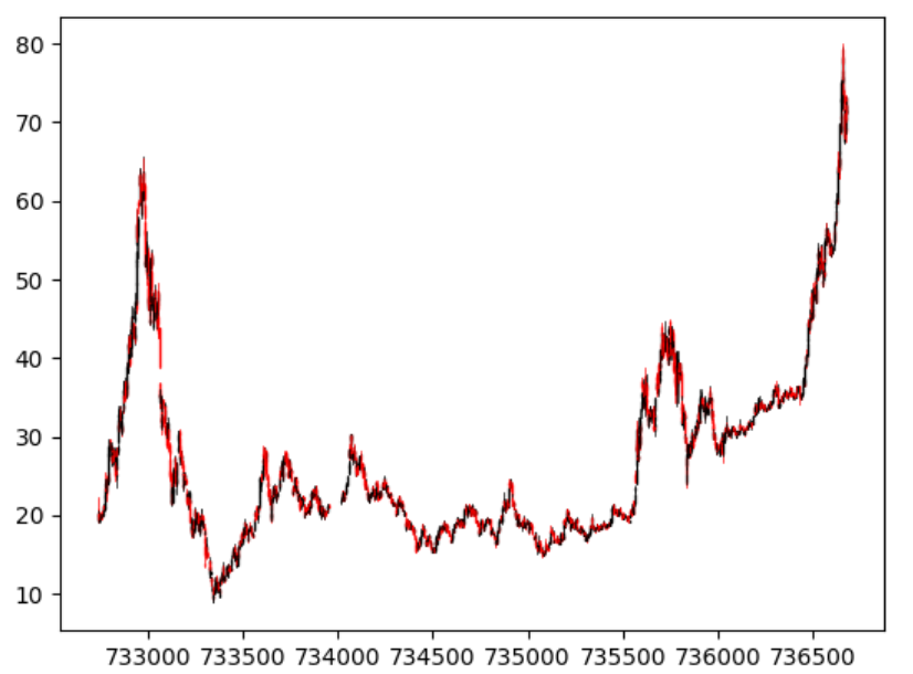
(3)使用上述包绘制k线图示例
# import matplotlib.finance as fin
import pandas as pd
import matplotlib.pyplot as plt
import mpl_finance as fin
from matplotlib.dates
import date2num
# 用于将datetime对象转化为浮点数
# 读取csv文件中保存的行情数据,使用date作为索引列
# na_values将None字符串解释为缺失值
df = pd.read_csv(
'601318.csv', parse_dates=[
'date'], index_col=
'date', na_values=[
'None'])[[
'open',
'close',
'high',
'low']]
# 添加time这一列
df[
'time'] =
date2num(df.index.to_pydatetime())
# 将df转换为数组才能传递给candlestick_ochl()函数
arr = df[[
'time',
'open',
'close',
'high',
'low']].values
# print(df)
'''
open close high low time
date
2007-03-01 21.878 None 22.302 20.040 732736.0
2007-03-02 20.565 None 20.758 20.075 732737.0
'''
# 由于candlestick_ochl函数中要求有Axes,因此创建画布和子图
fig = plt.figure()
# 画布
ax = fig.add_subplot(1,1,1)
# 子图
# candlestick_ochl()与candlestick_ohlc()的区别主要是执行顺序
fin.candlestick_ochl(ax, arr)
# fig.grid()
fig.show()
显示效果如下所示:
标签组:[数据可视化] [matplotlib] [函数图像] [plot]
上一篇:奥赛康K线图,股票奥赛康论坛
下一篇:Charts绘制K线图研究过程